The St. Regis New York Received a Much-Needed Makeover
-
Before: Guest Room
-
After: Guest Room
-
Before: Living Room Area
-
After: Living Room Area
-
Before: Bathroom
-
After: Bathroom
-
Before: King Cole Bar & Salon
-
After: King Cole Bar & Salon
-
Before: Lobby
-
After: Lobby

Twenty floors high and offering 229 rooms, The St. Regis New York is one of the most iconic hotels in the world. Built by John Jacob Astor IV, the richest person on the Titanic when it sank, it opened its doors in 1904. Just four blocks south of Central Park, the five-pearl hotel has played home to many celebrities and royals throughout its tenure, and its famed King Cole Bar has been a hotspot since 1932. But as with all hotels, constant updating is needed, even for luxurious, well-known properties. In 2013, The St. Regis underwent a major renovation to its guest rooms, restaurant, and lobby to combine old-world elegance with modern touches. Take a look at the luxury hotel's stellar makeover and let us know what you think in the comments!

Guest rooms prior to the renovation were pretty but a bit staid. They had an old-fashioned style that mixed blue and taupe fabric -- on the headboards, covering the nightstands, and hanging above the beds.

Guest rooms now have a much bigger personality: the bold blue damask fabric behind the beds; gray and off-white striped wallpaper; and black cabinets with gold trim come together to create vibrant, yet nonetheless elegant, rooms.

Living areas had silk tufted sofas, glass coffee tables, wooden desks with gold trim, and plain white lamps.

Though the work desks were not replaced, all the other furnishings were changed to give the spaces completely new looks. Now each sitting area sports a gray velvet couch with colorful throw pillows, a round, gold-trim coffee table, and lamps with a blue-and-white painted design. The wall behind the couch is now largely covered by rows of square mirrors.

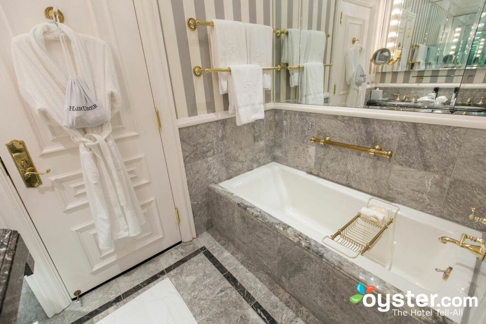
Bathrooms were outfitted in gray-and-black Italian marble, with dual vanity sinks and a lot of brass fixtures. They even each had a small television positioned in the corner above the bathtub.

Bathrooms were largely untouched, but they were already pretty luxe and didn't need much improvement. But wallpaper was changed, television sets were removed, and the gold-framed mirrors were removed for a more modern feel.

Guest rooms weren't the only part of the hotel to receive modern makeovers. Before renovations, the famous King Cole Bar & Salon had red carpet, white and gold tablecloths, and orange fabric chairs. It had the traditional look so many associated with the place, but it felt tired to most.

Now the King Cole Bar & Salon looks like it belongs in the 21st century -- while still paying homage to its stately past. It now has stylish gray patterned carpet, gray tablecloths, and shiny chair covers that create a chic, modern atmosphere. The stunning murals and chandeliers, however, remain.

The lobby was outfitted in nearly head-to-toe marble, with a lot of gold trim, and matching gold chairs. The sky-themed ceiling fresco added an upscale touch.

Not much was changed in the lobby; the chairs were replaced with more modern gray ones and the front desk was changed to an open style. But, like in the King Cole bar, the use of marble and cloud-filled fresco remained untouched.
What do you think of the renovations? Let us know!!
Related Links: